The curve went positive. Now comes the waiting.
July 28, 2026
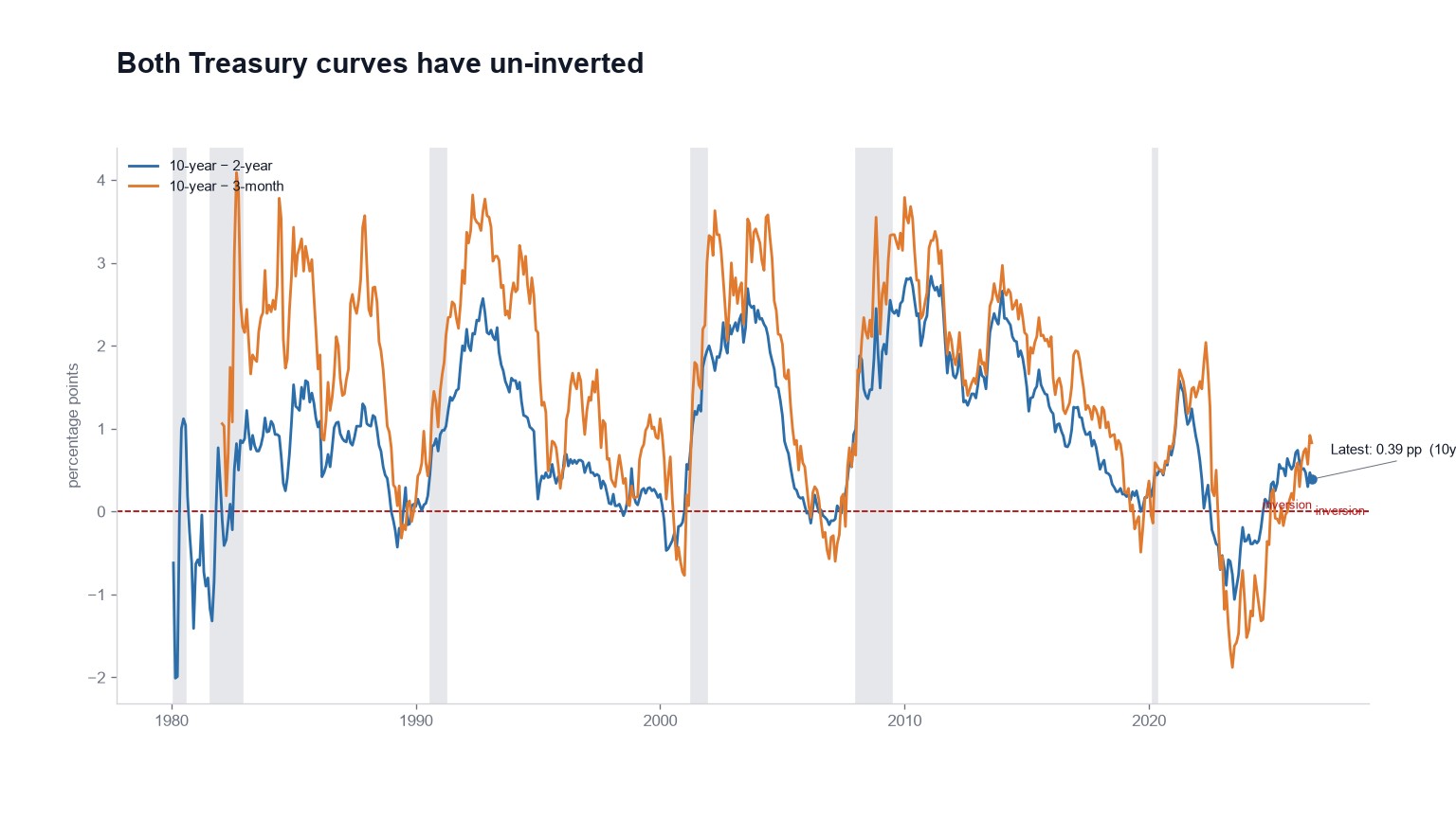
The 10-year minus 2-year spread is +0.39 percentage points and the 10-year minus 3-month is +0.83. Both went negative during this cycle and both have come back.
Neither reads Neutral on our page. Both read Caution, and that's a deliberate departure from how we grade almost everything else.
Positive is normal, and that's the problem
A positive curve is the textbook healthy condition. If these spreads had simply been positive all along we'd grade them Neutral and spend no further words on it.
That isn't the path they took. They were deeply inverted, and then they weren't, and the sequence carries information the level alone doesn't. Recessions have tended to arrive after the curve re-steepens, by which point a cutting cycle or a growth scare was usually already underway. The inversion is the signal; the un-inversion is the waiting room.
Why Caution is the middle band here
For most gauges on this site the middle band means Fair Value or Neutral, and a near-average reading is genuinely unremarkable. These two are the exception, and we'd rather explain the inconsistency than quietly smooth it over.
A near-average spread shortly after a deep inversion isn't evidence that conditions returned to normal. It's the portion of the cycle where the lag runs out. Grading it Neutral would be more consistent with our other bands and less honest about what the series has historically meant, so we broke the consistency. The FAQ spells out the mechanics, mostly so a +0.4 print doesn't get filed as a green light by someone skimming the page.
The cost of that choice is real: a reader comparing bands across gauges has to remember that Caution means something different here. We think that's the cheaper mistake.
Watch the shape, not the sign
Two things are worth tracking. Where each curve sits relative to its last inversion, and whether Sahm begins climbing off 0.
The curves were the early warning and that already happened. Sahm is the coincident confirmation and it hasn't come. What sits between those two events is the lag, and it's the part that gets skipped when someone says the curve looks fine now.
Neither spread votes on whether stocks are expensive, because they're cycle gauges. A steep curve alongside a 42× CAPE describes an expensive market in an economy that is still growing. Re-inversion would add cycle stress and still wouldn't be a valuation multiple. Both spreads, updated, sit on the homepage.