The red lines are an index of the past
July 21, 2026
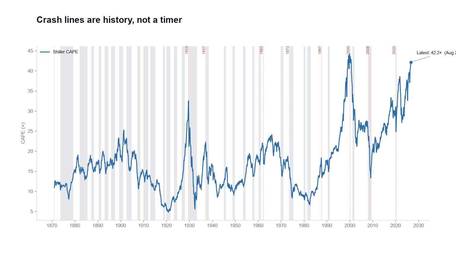
Every long-history chart on this site can display dashed red crash lines at 1929, 1937, 1962, 1973, 1987, 2000, 2008 and 2020.
They do one job. They let you see what a given gauge was reading at the moments the market actually broke. They are not a forecast, and nobody here knows when the next line gets drawn.
What they're good for
Mostly they're good for checking your memory against the record, which usually goes badly.
CAPE was extreme in 1929 and extreme again in 2000. It was not especially extreme in 1987, when the market still fell more than 20% in a single day. February 2020 was a pandemic rather than a valuation event, and we mark it anyway because the drawdown was real regardless of what caused it.
Remember only 2000 and every high CAPE starts to look like a countdown. Remember only 1987 and you'll conclude valuation never mattered in the first place. Both readings of history are selective, and having all eight lines on the chart makes selectivity harder.
If you want history to be genuinely useful rather than decorative, the decade-ahead table is the better tool. It reports weaker real returns following rich starting points across ten-year horizons, which is a claim about what you pay and what you get back. The crash lines are a smaller thing: an index of episodes, each with a short note underneath the chart.
What they're not
They aren't support, resistance, or a cycle clock, and a line at 2000 doesn't mean anything is due.
Several gauges have already passed their 2000 readings, including Buffett, Tobin's Q and household equity, while CAPE sits a shade below. That's a comparison between two moments in time, and comparisons place no obligation on the future.
Click any crash label on an indicator page for a paragraph on what followed. Then look at the live number, which is a level rather than a date.