The spending is coming from the people who own the shares
August 10, 2026
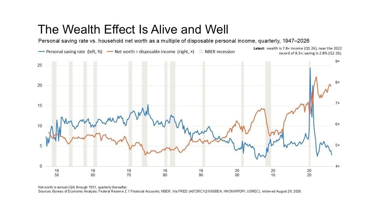
When household net worth rises relative to income, the personal saving rate tends to fall and spending tends to rise. Economists call this the wealth effect, and underneath the name it's the unremarkable observation that people loosen up when they feel richer than they did last year.
A few extra cents of spending per additional dollar of wealth sounds like a rounding error. It stops being one when you multiply it across a rise in household wealth measured in trillions. The Federal Reserve's ratio of household net worth to disposable personal income has been running near 8 times, well above its long-run average, and that gap has been doing real work in recent consumer spending and GDP figures.
Not households in general
The wealth in that chart is distributed nothing like evenly, so the aggregate hides who is actually doing the spending.
Corporate equities, and in particular a short list of AI-related names, sit overwhelmingly with households at the top of the distribution. Household equity allocation is the positioning counterpart of the same fact, showing the share of household financial assets already committed to stocks at a stretched level against its own history.
So when consumption holds up, it's worth asking whose consumption. That's how a market that looks expensive on Shiller CAPE, on the Buffett Indicator and on the overvaluation probability can still flatter GDP. High prices manufacture paper wealth for whoever already holds the paper, and those people spend some of it.
The headline saving rate of roughly 3% hides the same split. Wealthy households save little of current income because the portfolio has been saving for them. Lower- and middle-income households have been drawing down whatever buffer they had to keep spending while real incomes went nowhere. Identical arithmetic, opposite circumstances.
What the chart can't tell you
These figures are quarterly and run through 2026 Q2, so the monthly data has already moved past them. We'd rather say that here than let the chart imply more currency than it has.
The Bureau of Economic Analysis reported July real disposable income up 0.4% with real consumer spending flat, and the saving rate at 3.0%. Nominal spending rose 0.2% and prices rose 0.2%, which means the entire increase was inflation. One month settles nothing, but the link can stall well before a quarterly series catches up.
The mechanism runs both ways
A saving rate near 3% leaves almost nothing in reserve if asset prices correct. If the concentrated positions that created the wealth give some of it back, consumption can turn faster than fiscal or monetary policy can respond.
The AI trade doesn't soften that. By concentrating more of the gain in fewer names, held by fewer households, who account for a disproportionate share of national outlays, it widens the swing in both directions.
Valuations are rich and households are crowded into equities. The homepage tracks both. Tailwinds reverse.
Sources
- FRED — Households and nonprofit organizations net worth (TNWBSHNO)
- FRED — Disposable personal income (DPI)
- FRED — Personal saving rate (PSAVERT)
- FRED — Household equity as a share of financial assets (BOGZ1FL153064486Q)
- Bureau of Economic Analysis — Personal income and outlays
- Federal Reserve — Z.1 Financial Accounts