Why we don't grade this market against 1871
July 17, 2026
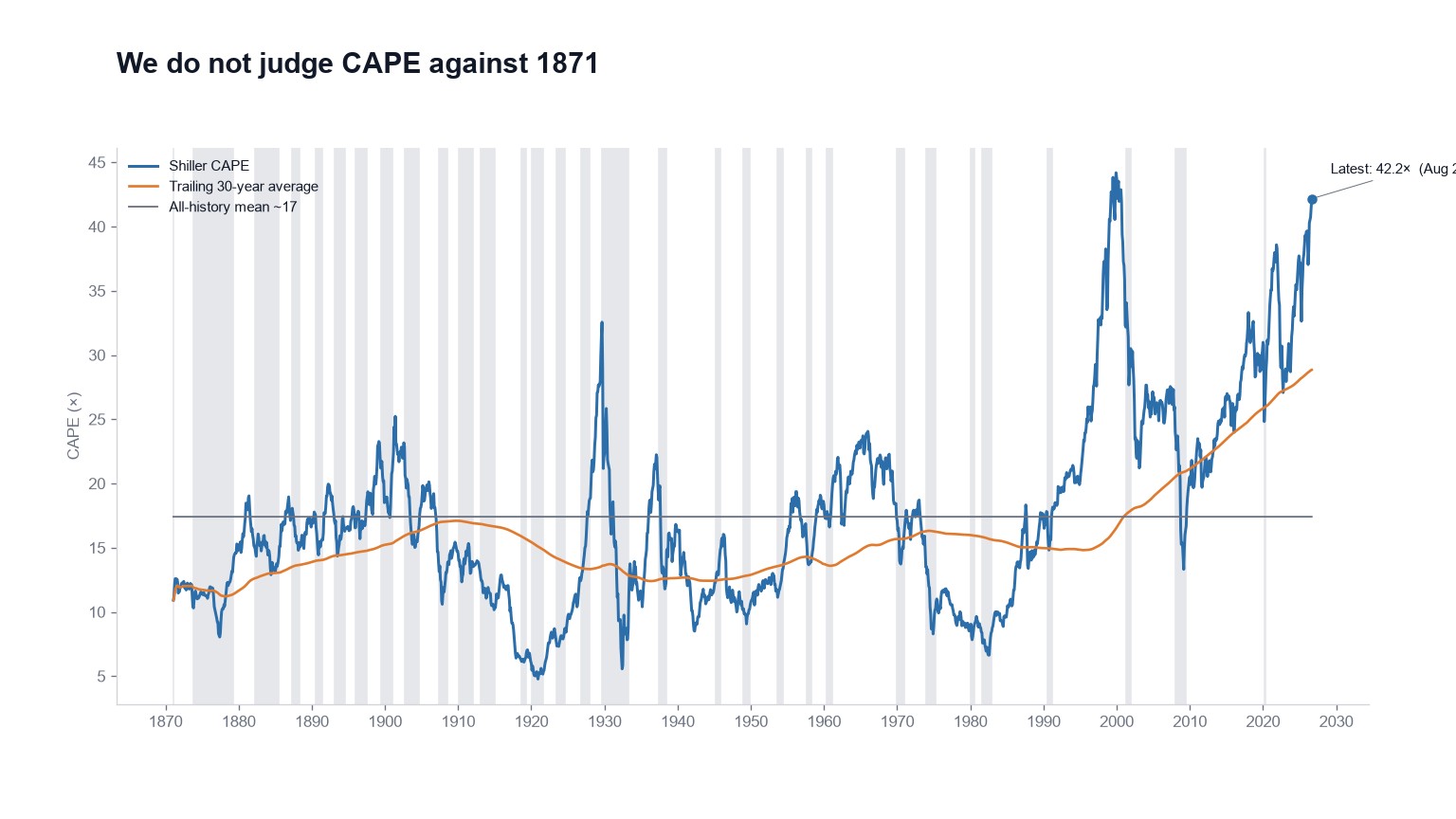
The Shiller CAPE has averaged about 17 across its full history, and today it reads 42.17×. That comparison has launched a thousand charts, and it stacks the deck in one specific way: it treats 1871, 1950 and 2026 as the same market, with the same accounting, the same investors and the same interest rates.
They aren't the same market. So for the long-history gauges whose definition of normal has clearly moved, meaning Shiller CAPE, Tobin's Q and household equity allocation, we grade against a trailing 30-year average with bands rather than a century mean no living investor has traded through.
What actually changed
Earnings aren't accounted for the way they were in the nineteenth century, which on its own makes a Gilded Age P/E a strange yardstick.
Then add everything else. Ordinary people own equities now, largely through retirement accounts that buy automatically every payday regardless of price. Interest rates fell for roughly forty years. Each of those changes pushed typical multiples up and kept them there, and none of them is going to reverse because a chart says the average is 17.
A rolling 30-year window lets the baseline travel with those shifts instead of demanding a snap back. CAPE can then be judged Overvalued against its own recent history, without anyone pretending fair value is still whatever your great-grandfather paid.
The ratios that grow structurally get an exponential trend for the same reason, meaning the Buffett Indicator and S&P 500 ÷ M2. The rest are graded against a flat historical mean, and the interest rate model already arrives in σ-units.
An easier test that still fails
This is the part that matters, and it's the reason we're comfortable with the adjustment. We moved the goalposts in the market's favor and it didn't rescue the reading.
The rolling mean sits well below 42.17×, and CAPE is Overvalued against it. Household equity at 45.8% is Strongly Overvalued against its 30-year average rather than against 1960.
A rolling baseline exists to be honest about regime change. It isn't a license to call everything fair, and if it were doing that we'd have picked the wrong baseline. The mechanics for each gauge are in the FAQ.
The live CAPE, with the number and the bands, is on the indicator page.