Two gauges, two answers, and rates are the difference
July 24, 2026
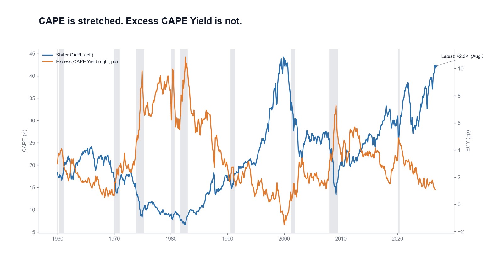
Shiller CAPE reached 42.17× on August 28, 2026, against a long-run average near 17. That's the number people screenshot, and on its own it's half the picture.
The other half is the Excess CAPE Yield. Take CAPE, flip it into an earnings yield, then subtract the real 10-year Treasury yield. What's left is the premium equities pay over the bond you could hold instead. It currently stands at 1.07 percentage points, which we grade Fair Value.
The historical average is somewhere around 3 to 4 points. Readings near zero are the danger zone, which is where 2000 got to. We're not there.
Different questions, different answers
CAPE asks whether the price is high relative to ten years of inflation-adjusted earnings. ECY asks whether the resulting earnings yield is any good relative to what bonds are paying.
Those come apart whenever real yields move. When real yields are on the floor, an expensive stock market can still be the best of a poor set of options, and ECY will say so. When real yields are healthy, the same CAPE becomes a genuine problem, because the alternative got better while stocks didn't get cheaper.
The chart shows the two lines disagreeing for years at a stretch. Through 2021, CAPE sat near records while ECY hovered around average, because real bond yields were below zero and made almost anything look reasonable by comparison.
Then rates normalized and CAPE didn't come down. ECY got squeezed toward a single point as a result. That's thinner than anything on offer through the 2010s and still wider than 2000.
Neither one is the lie
Both gauges vote, and both feed the overvaluation probability. CAPE reads Overvalued, ECY reads Fair Value, and the disagreement is information rather than a bug.
The interest rate model is a third angle on the same tension, comparing where the price index sits against where rates sit, and it's blunter than either: 4.15σ, Strongly Overvalued.
Watch only CAPE and every rate-driven rerating starts to look like 1999. Watch only ECY and you'll miss that the cushion between stocks and bonds keeps thinning while prices stay up. The homepage carries both at once, which is the only way either number means much.